This project is password protected
Enter the password to view this case study.
Incorrect password
Moving to V2
Enticing customers to a new version of the product
For Drift
Research, low/high-fidelity design, competitive analysis, prototyping, QA
Demand Gen Marketers, Marketing Managers, Marketers, Site Visitors
Product manager, tech lead, FE, BE
Q4 2020
Background
Drift is a leading conversational marketing and sales platform designed to help B2B companies generate more revenue by engaging website visitors in real time.
Instead of forcing potential customers to fill out static lead-generation forms and wait for a follow-up email, Drift uses AI-powered chatbots and live chat to start conversations immediately while a lead is still on the site. Core features include: AI Chatbots, Meeting Scheduler, Drift Intel, and Conversational Landing Pages.
Problem
Existing customers were split between V1 and V2 of the widget, which created issues for new feature development and for prioritizing incoming bugs.
Goals
Through conversations with customers and internal stakeholders, we identified a few key objectives that would unlock migration to V2:
- 🎯The position of the widget and corresponding button should be customizable
- 🎯Make V2 WCAG 2.1 AA compliant
- 🎯Create an easy way for customers to upgrade to V2
- 🎯Communicate changes between the two versions of the widget
Problem #1
Many customers on V1 have custom CSS applied to their widget, which changed its positioning on their sites. Upgrading to V2 removed that custom code.
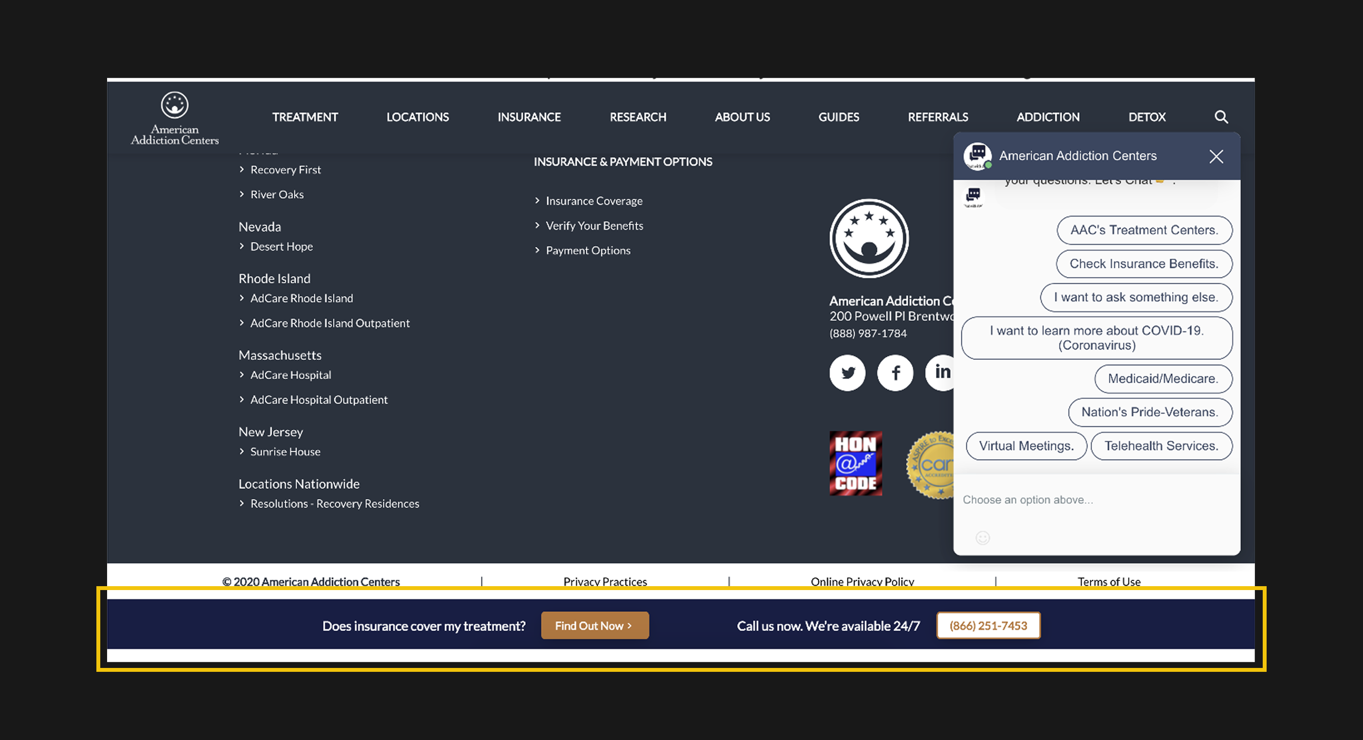
This is an example of a customer with an unexpected page layout (fixed toolbar) that obstructed the widget icon. When they tried to move to V2, they could no longer access the widget icon and had to revert to V1.
I started with a competitive analysis to understand what others in this space were doing.
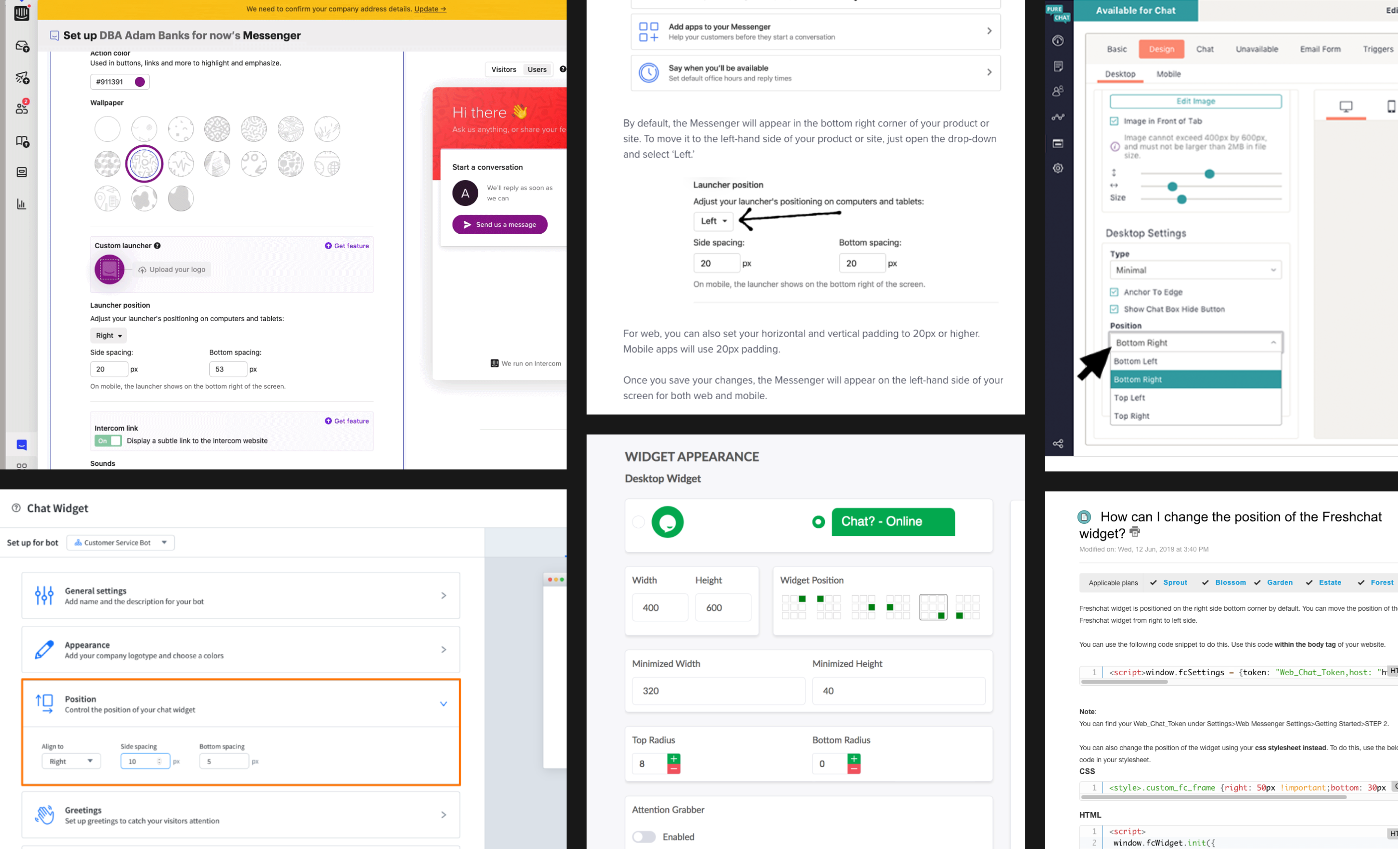
Findings that emerged from competitive analysis:
- This is a common setting across competing widgets and likely something customers expect.
- Terms like “position,” “alignment,” and “spacing” are used consistently.
- A visual companion helps customers understand the changes.
Solution #1
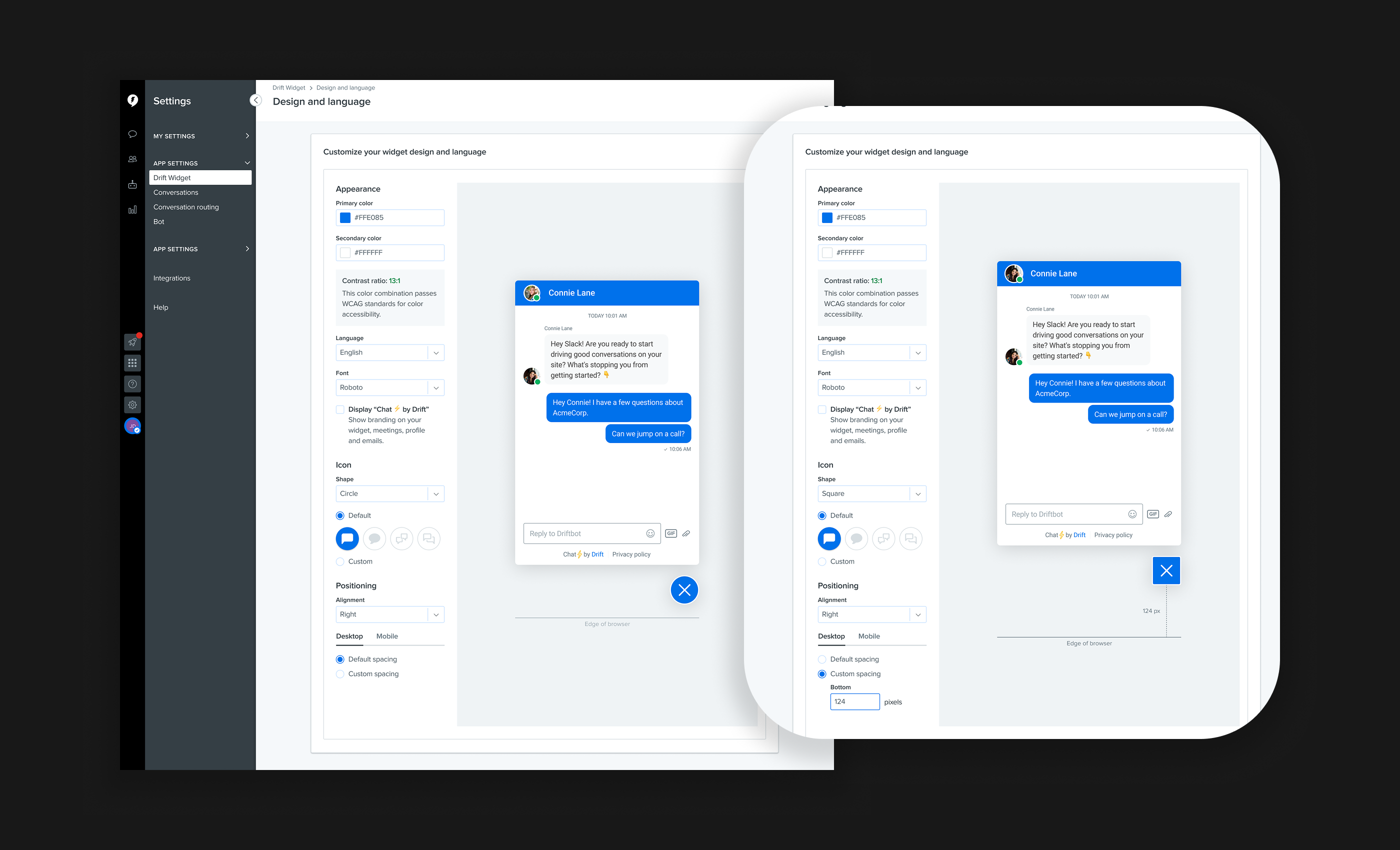
With a direction in mind, I started sketching to explore layout, interaction patterns, and state changes. Keeping the controls on the existing settings page made the most sense.
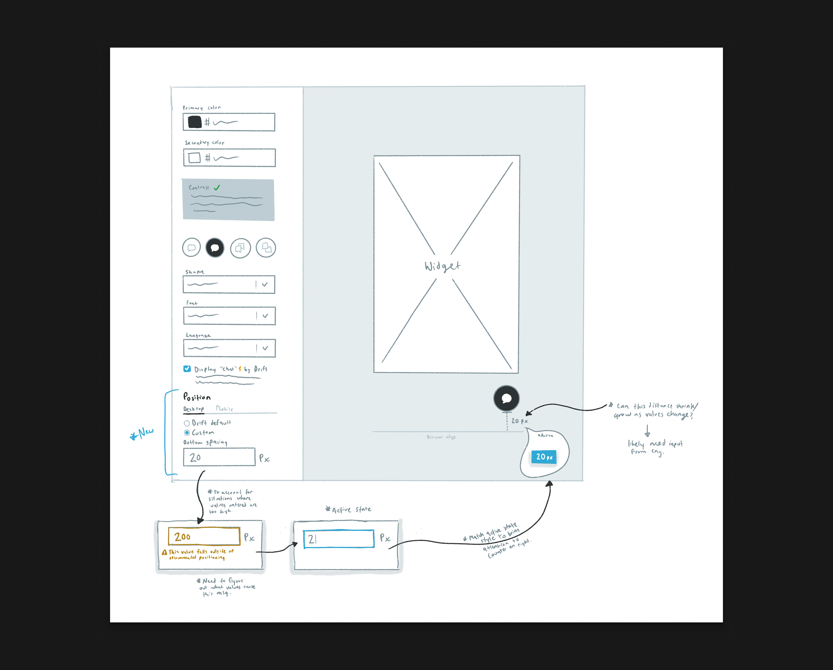
Once the sketches felt solid, I moved into higher-fidelity designs and fleshed out a more comprehensive set of states and the final interaction patterns.
Why this works
- ✅For users without content in the problematic area, we default to our standard spacing.
- ✅For users who need flexibility, we allow a custom value and an alignment selection.
- ✅A preview sets expectations for how the widget will appear on the site.
Problem #2
Customers were hesitant to move to V2 because it was not WCAG 2.1 AA compliant.
We worked with an outside agency that cited infractions including placeholder copy color refinements, composer state adjustments, and missing focus states on interactive elements.
The first two findings required minor color changes. For the third, I reviewed patterns across the web and popular applications.
Findings that emerged from competitive analysis:
- It was common to use a blue border, both in other widgets and across web apps.
- Slack leverages theme color selection, which makes the focus state feel more considered and systematic.
Solution #2
Based on these findings, I created a focus state that could be used across all functional components in the widget.
I also created a comprehensive state-change overview to communicate the full extent of changes to the engineering team.
Why this works
- ✅It inherits widget color selections to fit within the system. These colors are constrained by accessibility standards, which ensures compliant selections.
- ✅It is distinct from other state changes (hover, disabled, inactive).
- ✅A slight gap between objects helps ensure the focus state is not lost against a similarly colored component.
Problem #3
Customers were unable to upgrade to V2 of the widget. As with the other phases, my first step was to review how other tools handle opting in.
Findings that emerged from competitive analysis:
- Common upgrade themes include ease of use, better performance, workflow improvements, and stylistic updates.
- Contextual dialogues felt better suited to a product walkthrough, which we were not doing. A modal overlay made more sense.
- Drift already had styles in place for similar modal dialogues. Leveraging a design system component would bring continuity to upgrades across the platform.
Solution #3
I mapped out the flows for opt-in, opt-out, and automatic upgrade. This workflow diagram also helped identify features to include in the upgrade walkthrough.
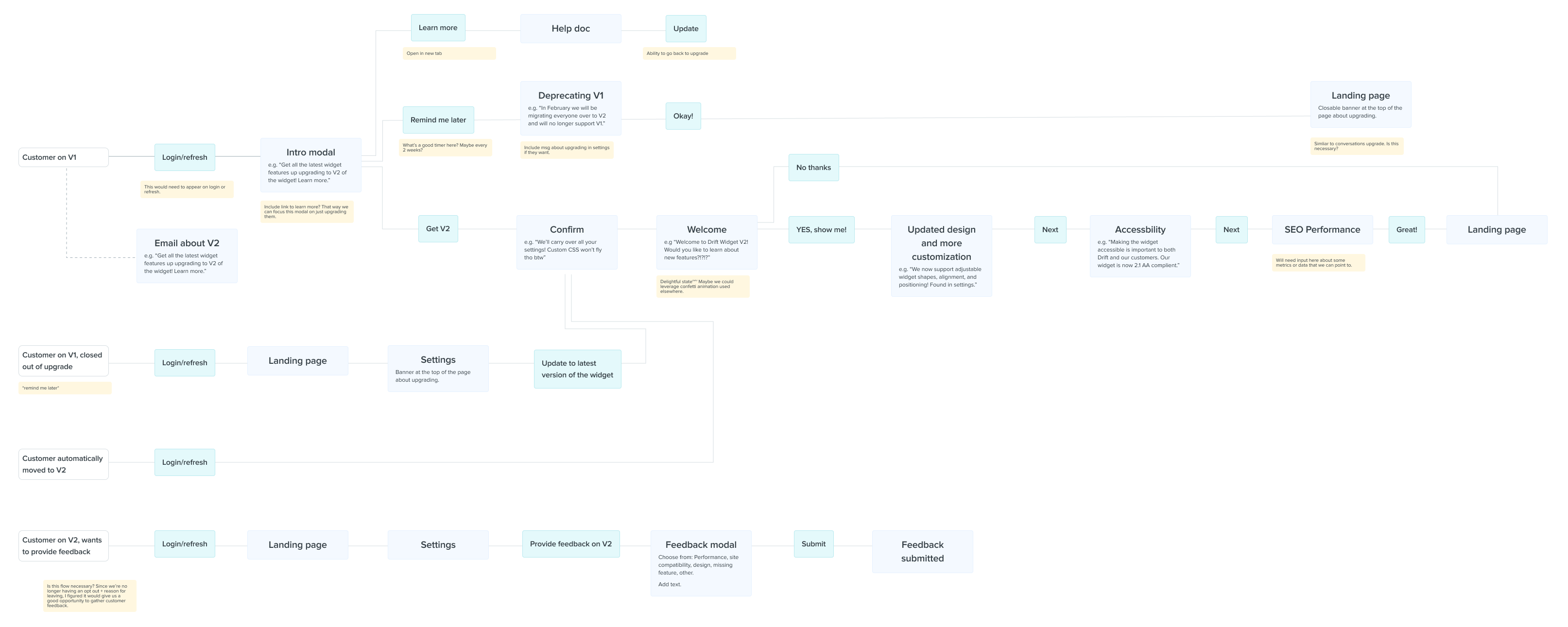
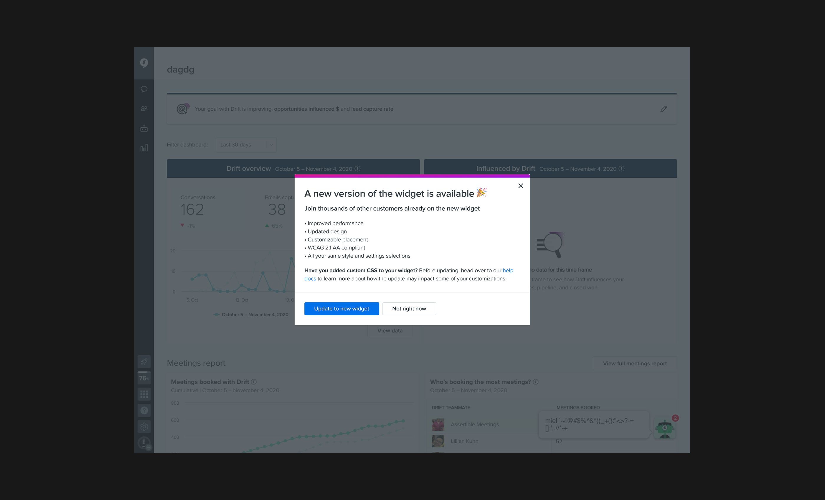
I then moved into the design phase and created a modal sequence to guide customers through the upgrade.
Why this works
- ✅It includes a scannable summary of updates, addresses customer concerns, and keeps interactions simple with clear CTAs.
- ✅A customer metric provided a concrete incentive for upgrading. I knew customers (and Drift) cared about accessibility, and emphasizing this in V2 also helped close some prospective deals.
Results
Our goal was to get the V2 Widget adopted by 100% of customers still on V1 by the end of the quarter. We migrated about 82%.
Some customers moved back to V1 due to unforeseen technical issues, which the team swarmed around and prioritized. By the end of Q1 2021, we were at 100%.
Learnings
- This was a project more than two years in the making and involved many teams. Understanding the “why” when picking up a project helps build a stronger foundation to work from.
- Competitive analysis can be a shortcut to a solution. No need to reinvent the wheel with industry-established patterns.